
Line Graphs: 06-Line Graphs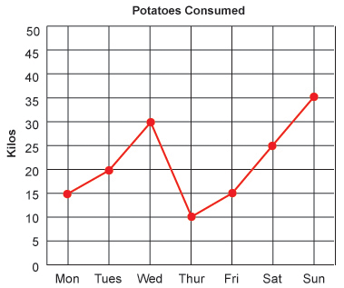 Line graphs are another type of graph that comes a bit easier than others, and again, is also one that we will see more frequently throughout life. If you notice the x-axis is representational of time. You will commonly see this on line graphs because the line connecting the dots is able to represent the gradual change over the elapsed time. It would allow to predict certain answers without using the exact dots. Other than that, it works the same as our coordinate planes. We would go over to the day that we want, and up to the number we want. The label to the left of the y-axis will tell you what the numbers represent, and the title of the graph will give you the overall data.
If you were asked, “How many kilos of potatoes were consumed on Thursday?” You would follow the x-axis to Thursday, find the dot above it and see that 10 kilos were consumed.
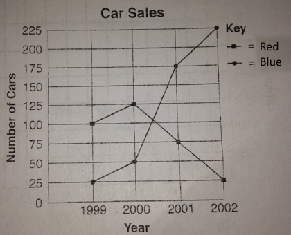
Double line graphs works the same way, with one exception. Notice the key in the top right corner. It tells you what each line represents.
The title tells us we are looking at a graph that represents Car Sales. The x-axis shows us that we’re looking at four different years. the y-axis represents the numbers. The key tells us that we need to look at the dots. The line with the circular dots represents the number of blue cars. The line with the square dots represents the number of red cars.
Questions for these kinds of graphs will be more comparative. Which color car sold better in the year 2001? The circular dot is the higher dot on the graph which tells us that blue cars sold better in 2001.