Assignment: 08-Histograms
Similar to a bar graph. Similar to a line graph. Similar to a line plot. Yet, a different graph all of its own.
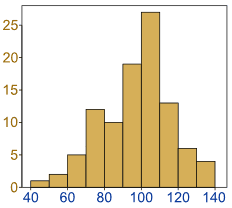
 A histogram is a graphical display of data using vars of different heights. Yes, I realize this sounds and looks very similar to a bar graph. Notice that there are numbers on both the x and y axis. This is more typical of what you might see on a line graph rather than a bar graph. Also notice that each bar seems to represent an interval. This is more typical of what you might see on a line plot.
YAY for smashing three different types of graphs into one!
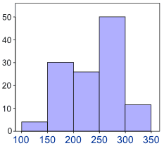
Let’s display a graph that actually has a bit of meaning to it. The histogram below represents the height of orange trees in an orchard. The heights of the trees vary from 100 cm to 340 cm.
Take a careful look at the x axis. Notice that it counts by 50. The bar between 100 and 150 represents all the trees that are in between those two heights. If you look at how high the bar goes, it tells you, of all the trees in the orchard, there are four of them that are between 100 cm and 150 cm.
Some types of questions you might see for reading a histogram:
* Which interval has the most trees in it?
Ans: 200-250
* How many trees are there between 300 and 350?
Ans: 11

