Assignment: 03-Frequency Table and Line Plots
As we learn in science, the word frequency means how often something happens. A frequency table takes a set of data and tallies the amount of times certain bits of data happen. It can either use the individual bits of data, or group them into a certain range. Let’s say Officer Harris has been working his speed trap again. He recorded the following speeds:
 We will begin by creating intervals to group the numbers into. Groups of ten would work best: 30-39, 40-49, 50-59, 60-69. From there, we will make a tally for each number that falls into those categories.
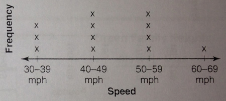
30-39 : 32, 38, 34
40-49 : 46, 43, 41, 47
50-59 : 55, 57, 52, 59
60-69 : 61
The chart below shows that information in a frequency chart.
 To turn that frequency chart into a line plot, we start with a line graph. On the line graph, we would make four spots for those intervals. For each tally mark, we’ll put an x above that interval. The line plot for this data would look like this.