
Topics:
1. Bar Graphs
2. Line Graphs
3. Box and Whisker Plot
Bar Graphs
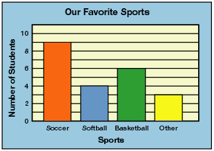 Above is a visual representation of a bar graph. It is one of the simpler types of graphs we’ll work with this year. Coincidentally, it’s also one of the more common types of graphs we’ll continue to see throughout life. To a point, it is similar to what we’ve worked with using the regular coordinate plane. Notice the y-axis works exactly the same, where the numbers get larger the higher up they get. There will always be a label next to the y-axis telling what those numbers represent. In this case, the y-axis represents number of students. The title, “Our Favorite Sports” tells us that it represents the number of students who like a certain sport. The specific sports in question move along the bottom of the graph.
We could read this graph to know that 9 students chose soccer, 4 chose softball, 6 chose basketball, and 3 chose something different.
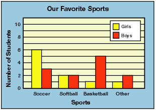 This second graph is a double bar graph. A double bar graph works the same way, but takes it one step further. Notice the key in the top right corner. It tells us that the yellow bar stands for the girls and the red bar stands for the boy. From this graph we can now tell that of the 9 students who chose soccer, 6 of them were girls and 3 of them were boys. You would be able to see this same information for softball, basketball and other as well.
Line Graphs
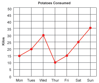 Line graphs are another type of graph that comes a bit easier than others, and again, is also one that we will see more frequently throughout life. If you notice the x-axis is representational of time. You will commonly see this on line graphs because the line connecting the dots is able to represent the gradual change over the elapsed time. It would allow to predict certain answers without using the exact dots. Other than that, it works the same as our coordinate planes. We would go over to the day that we want, and up to the number we want. The label to the left of the y-axis will tell you what the numbers represent, and the title of the graph will give you the overall data.
If you were asked, “How many kilos of potatoes were consumed on Thursday?” You would follow the x-axis to Thursday, find the dot above it and see that 10 kilos were consumed.
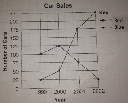
Double line graphs works the same way, with one exception. Notice the key in the top right corner. It tells you what each line represents.
The title tells us we are looking at a graph that represents Car Sales. The x-axis shows us that we’re looking at four different years. the y-axis represents the numbers. The key tells us that we need to look at the dots. The line with the circular dots represents the number of blue cars. The line with the square dots represents the number of red cars.
Questions for these kinds of graphs will be more comparative. Which color car sold better in the year 2001? The circular dot is the higher dot on the graph which tells us that blue cars sold better in 2001.
Box-and-Whisker Plots
We’re going to use the following data set to help us create and understand Box-and-Whisker plots:
14, 21, 19, 12, 13, 24, 26, 19, 15, 25, 19
Step 1: Find the median of the data.
To find the median, remember, we have to put the numbers in order and find the middle number.
12, 13, 14, 15, 19, 19, 19, 21, 24, 25, 26
The median of this set of data is 19.
Step 2: Find the upper and lower quartiles. If you look at the root of the word, quart. A quart is a fourth of a gallon. A quarter is a fourth of a dollar. The root tells us to divide the data into fourths. The median split the data in half. to find the quartiles, you find the median of each of the halves.
12, 13, 14, 15, 19 —————— 19, 21, 24, 25, 26
The median of the lower half is 14. This number represents our lower quartile. The median of the upper half is 24. This number represents the upper quartile.
Step 3: Find the extremes. These are exactly as they sound. The extremes are the greatest and least values in the set: 12 and 26.
Step 4: Draw a line that includes all of the numbers in the data set. This should include all numbers from 12 to 26. It is drawn in green in the plot below.
Step 5: Above the line, draw a point for each of the numbers we’ve previously calculated: The median, 19, the quartiles, 14 and 24, and the extremes 12 and 26. This step is pictured in red below.
Step 6: Draw a box that begins at the lower quartile and ends at the upper quartile. Draw a line in the box at the median. This is pictured in blue below.
Step 7: Draw the whiskers. This is lines that come from both ends of the box and end at the extremes. This is purple in the picture below.
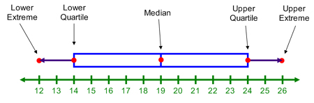
This type of graph is an easy way for us to represent those hot spots (upper and lower extremes, upper and lower quartiles, and the median) all in one quick and easy to read graph.
hi this is Leanne Winsett you should teach this to the class it makes more sense than memorizing it. It is the Hey Diddle Diddle poem.
Hey diddle diddle the median’s the middle
You add then divide for mean
The mode is the one you see the most
And range is the difference between.
It makes more sense and I did not know that a quartiles were more medians.