
Topics:
1. Samples and Surveys
2. Mean, Median, Mode, and Range
3. Frequency Tables and Line Plots
4. Stem and Leaf Plots
Samples and Surveys
This unit begins our unit on statistics. Much like the word algebra, the word statistics alone can make things seem word than they are, so we begin simply by defining what the word statistics means:
Statistice - a science that deals with the collection, classification, analysis, and interpretation of numerical facts or data
So, what does that mean? We’re going to be dealing with different ways to look at an interpret data. To do this, throughout the unit we’ll learn about various different types of graphs and such.
Before we get into any graphs, we want to start by learning the basics. When you take a collection of data, you take it from what is known as a population. the population is simply who or what is surveyed for the statistic given. Are we asking the boys in the school? Are we asking female drivers? Are we looking at the color of cars that are sold? All of these could be different populations.
Next we need to understand the difference between the entire population and a sample population. The entire population would include every single person or thing within a given range. So, if we give a statistic such as 81.4% of all Utahans have lived in the same house for more than a year, to have sampled the entire population, we would have to have surveyed every single Utahan. Most statistics given are based on a sample population, which is only a part of the population studied for a given statistic.
Here are some more examples of surveys given to entire populations. As you read the statistics, think about the population, and how possible it is to have surveyed the entire group to get the statistic.
48% of the students in our class are boys
11% of the teachers at SAA are male
Here are a couple of examples of statistics given only to a sample part of the population. As you read the statistics, think about how near impossible it would to talk to every single person within the population.
Humans live an average of 67 years.
24% of M&Ms are blue.
Mean, Median, Mode, and Range
For this section, I will use the data pictured below. We’ll say this is a student’s scores for 8 tests.
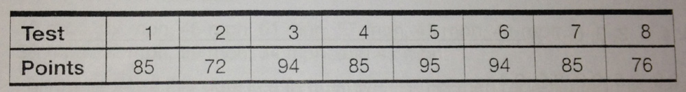 Range – the distance between the highest number and the lowest number. In this set of data those would be 95 and 72. To find that distance, you find the difference, meaning you subtract.
95 – 72 = 23
The range is 23.
Mean – the average of the numbers. To find it, you add all of the numbers together and divide by the amount of numbers there were.
85+72+94+85+95+94+85+76=686
686 ÷ 8 = 85.75
The mean is 85.75
Median – the middle number in the set of data. To find it, you put the numbers in order, and find the one that is the exact middle. If there are two middle numbers, then you find the mean of those numbers.
72, 76, 85, 85, 85, 94, 94, 95
In this example there are two middle numbers, 85 and 85.
85 + 85 = 170
170 ÷ 2 = 85
The median is 85.
Mode – the number that occurs the most often. If every number only occurs once, there is no mode. If several numbers occur the same amount of times, than there can be more than one mode.
72, 76, 85, 85, 85, 94, 94, 95
In this data, 85 occurs three different times, so 85 is mode.
Frequency Tables and Line Plots
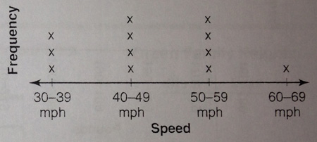
As we’ve learned in science, the word frequency means how often something happens. A frequency table takes a set of data and tallies the amount of times certain bits of data happen. It can either use the individual bits of data, or group them into a certain range. Let’s say Officer Harris has been working his speed trap again. He recorded the following speeds:
 We will begin by creating intervals to group the numbers into. Groups of ten would work best: 30-39, 40-49, 50-59, 60-69. From there, we will make a tally for each number that falls into those categories.
30-39 : 32, 38, 34
40-49 : 46, 43, 41, 47
50-59 : 55, 57, 52, 59
60-69 : 61
The chart below shows that information in a frequency chart.
 To turn that frequency chart into a line plot, we start with a line graph. On the line graph, we would make four spots for those intervals. For each tally mark, we’ll put an x above that interval. The line plot for this data would look like this.
Stem-and-Leaf Plots
Stem-and-leaf plots are just another way of representing data. Stem-and-Leaf plots work best if all of the numbers in the data set are greater than 9 and less than 100 (between 10 and 99).
Let’s say there are a group of 8 friends who want to chart their reading minutes for a week. Below is a chart showing the amount of minutes they have read.
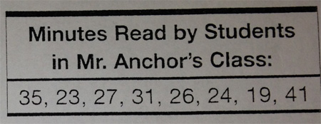 The first stem in creating a stem-and-leaf plot is to put the numbers in order..
19, 23, 24, 26, 27, 31, 35, 41
From there, think of the stem as the tens, and the leaf as the ones. We are going to create a table with two columns, putting the tens into one column, and the ones in the other, the ones being adjacent to the 10 they were with.
